Outline
|
 |
Lab 12
|
|
So far we have spent most of our time looking at how a single variable is distributed. All the statistics we have studied are univariate statistics. However, as researchers, we are often more interested in how different variables may be related to one another. To investigate, we need bivariate statistics. In this lab we will examine ways in which we can describe how two variables (distributions of the variables) are related to one another. For this lab we will focus on describing this relationship as a descriptive statistic. In a later lab we will return to this issue, but as an inferential statistic (within the hypothesis testing framework).
Let's consider an example: suppose that we're
interested in variables are related to a
person's height (interval-ratio data so we're
looking at the Pearson r test). Our first step
is to identify a variable that we think might be
related (e.g., teenagers height and the average
of their parents' height), and then we examine
how the distributions of each of these variables
co-vary with one another. By co-vary, I
mean, as the values of height go up, what
happens with the corresponding values (your
parent's average height)? As we have already learned, Variance (the square of standard deviation) measures how much the values of a variable deviate from the mean. Covariance measures how much a pair of random variables tend to deviate in the same direction. For example, if we expect that a teenager's height and their parents average height are positively related, we should expect to see that teens who score high above the mean on height should also be likely to have parents taller than average. Teens who are shorter than average should have parents who are shorter than average. We're going to look at several aspects of examining these relationships:
Scatterplots
The values of one variable appear on one axis and the values of the other on the other axis. A point on the scatter plot represent the values of each variable for a particular individual. Note: if you have an experiment in which you've declared a response variable and an explanatory variable, always plot the response variable (Y) on the vertical axis and the explanatory variable (X) on the horizontal axis. Consider the follwing example:
Notice that each dot represents a single individual. The location of the dot is determined by the values of the two variables for that individual. To interpret a scatterplot we should: Form refers to how the scores
cluster together. Direction refers to the kind of relationship. positively associated variables are when above-average values of one variable tend to accompany above average values of the other variable (and the same for below-average scores) negatively associated variables are when above-average values of one variable tend to accompany below-average values of the other variable no association when there doesn't appear to be a pattern to the scatterplot
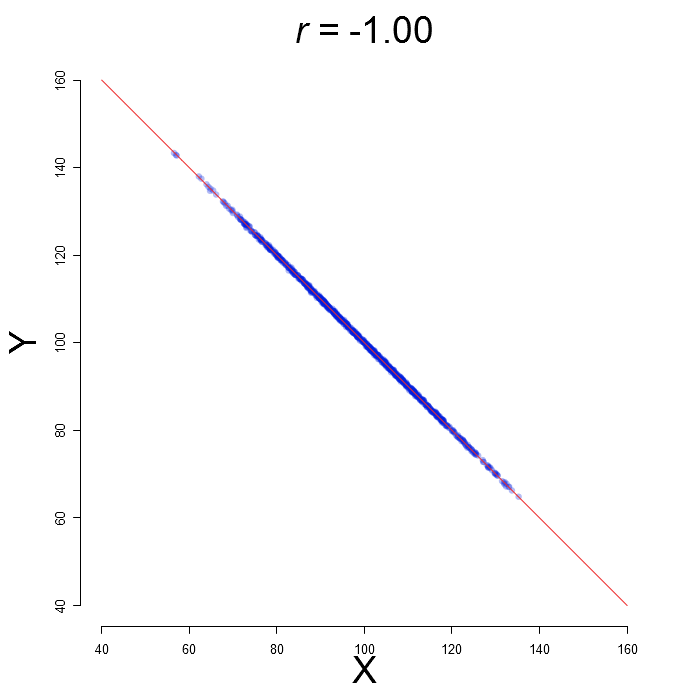 In the above example, we have a fairly
linear relationship, the association is
positive, and the points are fairly tightly
clustered without any outliers.
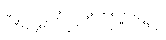
_____ Strong positive association _____ Medium strength negative association _____ Medium strength positive association _____ No association
Computing the Correlation Coefficient (r)
(by hand)
|
||||||||||||||||||||||||||||||||||||||||||||||||||||||||||||||||||||||||||||||||||||


| X |
Y |
 |
 |
 |
 |
 |
|
| 0 |
1 |
||||||
| 10 |
3 |
||||||
| 4 |
1 |
||||||
| 8 |
2 |
||||||
| 8 |
3 |
||||||
| Sums |
30 |
10 |
|||||
| Means |
6 |
2 |
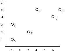
2a) Calculate the SP.
2b) Calculate the SSx.
2c) Calculate the SSy.
2d) Calculate the Pearson correlation (r).
Correlation and Scatterplots in SPSS
Open the dataset: height.sav This fictional dataset contains the height, weight, age, and gender information for 40 individuals. Additionally, it has the average calcium intake, household income, and average parental height.
Suppose
that we want to examine the relationship
between the age and income variables.
In the menu, click Analyze → Correlate → Bivariate

Select the variables that you want correlated (you can have more than two at a time) and click the arrow button.

When you click OK, you will see the
correlation matrix in the output window. The
correlation between age and income
(r = 0.328) is circled in
red.

Additionally you may wish to see a scatterplot of this relationship. To do this you go into the menu, click Graphs → Chart Builder. (Note: the screenshots here use a different dataset, but the basic windows and procedure still follow)


Choose the top left scatter type and drag it into the large white box above. It should now look something like this.
Now drag the variable you want on the horizontal axis onto the box that says X-axis. Drag the variable you want on the vertical axis onto the box that says Y-axis. For correlation, it doesn't make any difference what variables are entered on the X-Axis and Y-Axis. For now, try plotting income as your Y variable and age as your X variable. (We'll see later that if one variable is the explanatory variable, it goes on the X-axis, and the outcome variable goes on the Y-axis.)

Click OK and you will see a scatter plot like the one below.

Your instructions for the first correlation will look like this. To do successive correlations, you just have to drag-and-drop the different variables.
(3) Make scatterplots that plot the relationship between our response variable "height" and our 3 quantitative explanatory variables. (avgphgt, calcium, income). Cut and paste these into your worksheet. For each scatterplot describe the nature of the relationship (in terms of direction and strength).
(4) Make a scatterplot of height and weight and include gender as a categorical variable. (mark the cases by gender). Paste your scatterplot into your worksheet. How does the relationship between height and weight compare for men and women?
(5) Compute a correlation matrix that computes the correlation coefficients between 5 of our variables. (height, weight, income, calcium, avgphgt). Copy and paste these into your worksheet. Which variables have the strongest correlations? Which variables are negatively correlated?