To this point, we have looked
at scatterplots and "imagined" a line running
through the datapoints that characterizes the
general linear pattern of the data. In today's
lab we'll actually put the line onto the
scatterplots. This process is called Regression.
This is the other test looking at relationships
for interval-ratio data at the bottom of our
diagram.
Lines and graphs
Let's start by talking about
lines and graphs. Consider the following graph.
 |
at X = 0, Y = 1
at X = 1, Y = 1.5
at X = 2, Y = 2.0
at X = 3, Y = 2.5
at X = 4, Y = 3.0
So as X goes up by 1,
Y goes up by 0.5. This is called the slope
(b). This is a constant.
The intercept
(a) is the value of Y when X = 0. In
other words, this is the point at
which the line intersects the Y-axis.
This is also a constant.
We can describe the
line in the following linear equation:
Y = slope * X +
intercept= Y = bX + a
For our example: Y =
(.5)X + 1.0
For our example, if X
= 3, then Y = (.5)3 + 1.0 = 1.5 + 1 =
2.5.
If we look at the
graph, X = 3 and sure enough Y = 2.5.
|
In other words, using the
linear equation, we can determine the value of
Y, if we know the values of X, b (slope), &
a (intercept).
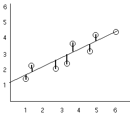
Now let's return to our
scatterplots. Let's start with the simple case
of r = 1.0. In this situation it is easy to
decide where our line goes, because all of the
data points fit exactly on the line (remember
that's what a "perfect" correlation refers to, a
"perfect fit").
 |
 |
|
When we do a regression
analysis, what we are doing is trying to
find the line (and linear equation) that
best fits the data points. For this
example it is pretty easy. There is only
one possible line that makes sense to
fit to this set of data. To find the
line all we need to do is draw a
straight line through all of the points
and then to figure out the equation for
that line we can just look at it the way
we did in the above example (in fact if
you look carefully you'll see that the
this is the same line as the one in the
above example).
|
 |
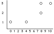
Now let's look
at a case when the correlation is not
perfect. |
 |
Now it isn't as
easy. Clearly no single straight line
will fit each data point (that is, you
can't draw a single line through all
of the data points). In fact it is not
too hard to imagine several different
possible lines fitting to this data.
What we want is the line (and linear
equation) the fits the best. |
For the questions in this lab,
you need to open the SPSS height.sav
file.
In SPSS, make scatterplots
that plot the relationship between the outcome
variable "height" (in inches) and 5 predictor
variables:
average of parent's height
(avgphgt),
average household income of
parents (income),
average daily calcium intake
over the first 5 years of life (calcium),
current age (age), and
current weight in pounds
(weight).
1) Make
scatterplots that plot the relationship
between our response variable "height" and
our 5 quantitative explanatory variables.
(so you'll need 5 plots). Copy and paste
these into your worksheet.
- average of your parent's height
(avgphgt)
- average household income of your
parents(income)
- average weekly calcium intake over the
first 5 years of life (building bones,
etc)(calcium)
- your current age (age)
- your weight (weight)
Make sure that you put
height on the vertical axis. On each,
pencil in your best guess for the "best
fitting line". Based on your line, what are
the slope and intercept for each (don't worry
about being exact on these, but give it a good
guess). Remember that the intercept is where
the line crosses the Y-axis when X = 0.
The scales on your scatterplots may not
include an X = 0 point. You can change the
scale of your scatterplot in the Chart
editor under the "chart" menu (axis
submenu; if you can't figure it out more
detailed instructions are in the section that
follows).
What does it mean to be the line that
best fits the data?
Basically what we want to do is minimize
the error. That is, the line that
differs the least from all of the data
points is the best fitting line.
remember what the line is, it is a formula
(a linear equation) that predicts the value
of Y given X, a, & b. So what we want to
do is pick the line that gives the best
estimate of Y. That is, the line that
makes the smallest error in estimating all
of the Y values.
So how do we do this (by hand, so we
understand what goes into the computations)?
We find the least-squares solution
To get this we'll look at each point, and
compare the actual value for Y with the
predicted value of Y (called , or  (pronounced
"Y-hat")) (pronounced
"Y-hat"))
| Note: You should notice that an
important difference between
correlation and regression is that
with correlation it doesn't matter
which variable is assigned as the
independent (explanatory) variable
X, and which is assigned as the
dependent (response) variable Y.
However, for regression it DOES
matter. In regression we are
predicting the outcome of Y based
on X. |
 |
distance = Y -
SSerror = total squared
error = formula
We get the values from the line, and
the Y values from the actual data
points
We need to do this for all of the
values of a and b.
|
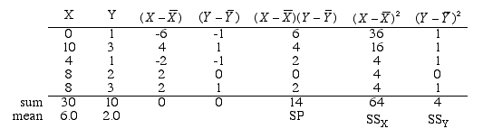
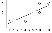
 	X	Y
	0	1
	10	3
	4	1
	8	2
	8	3
sum     30	10
mean	6.0	2.0
|
Our first step was to draw
the scatterplot
|
Based on this scatterplot we will
expected an r that is positive
and fairly strong (because the points
cluster fairly strongly around an
imaginary straight line). So then we computed
r and found that it to be:
+0.875 |
So now our next step is to compute our
regression equation for this data?
So the regression equation is:
| = .22(X) + .68
|
 |
Okay, so now we know how regression works and
(if we must) we can do it by hand. Now let's see
how to do regression in SPSS. We'll start with
how to get SPSS to put a least squares
regression line on our scatterplot and then
we'll discuss how to get the regression
equation.
Using SPSS to put a least
squares regression line on a scatterplot
After a scatterplot
is created, we can fit a least squares
regression line on the plot by using the Chart
Editor.
- To open the chart editor,
you need to double click on the graph of
interest. This will open up the Chart Editor
in a new window.
- Then click on the icon shown below.
(If
you hold the cursor, a pop-up name will
appear: Add Fit Liine at
Total.) Your
scatterplot should now have a line on it.

One of the important questions in regression
is where the fitline (AKA regression line)
crosses the Y-Axis. The chart as it
appears now is misleading because neither the
X nor Y axes start at 0
where you are accustomed to see them.
While the Chart Editor is still open, click
the Y-axis so that it is
highlighted. Now double-click it so that a
properties box appears to the right. This can
be tricky, so do it precisely. Click the Scale
tab if it is not already selected. Set the
minimum box to 0. It will look something like
this:

Now repeat the same process for
the X-axis and set the minimum to 0.
Also, check the box that says, Display
line at origin.

Click Apply. This will
re-scale the scatter plot so that you can see
where the fitline crosses the Y-axis.
2) Remake the
scatterplots that we plotted earlier, but
this time have SPSS plot the least squares
regression lines on the plots. How well do
those lines compare to your estimates that
you drew earlier?
Some facts about using least squares
regression
- As we already mentioned, unlike
correlation, in regression the distinction
between explanatory and response variables
is very important. If you look back
at the doing regression by hand part of the
lab you'll notice that we are only looking
at the deviations from the line for the Y
variable (in the Y direction). That is
because, we are trying to use X to predict
Y, or to explain the variability in Y.
- There is a close connection between
correlation and the slope of the
least-squares line. This was also discussed
above.
- The least-squares line always passes
through the point (
 , , ). ).
3) Use
SPSS to compute the mean of the variables
and check to see if all of your scatterplots
with the least squares regression lines pass
through the (,) point.
Using SPSS to
compute the least squares regression equation
and test for a relationship


4) Use SPSS to
compute the regression components (slope and
intercept) for the 5 relationships (e.g.,
height by parent's avg. height, height by
age, height by calcium, etc). How well do
those lines compare to your estimates that
you drew earlier?
Using Regression to Test for a
Relationship
We can also use our regression technique to
test for a significant relationship between
two variables. Remember that when we perform a
regression, we calculate a slope (b) for the
"best fit" line to describe the data. SPSS
provides a test (a t-test) to determine if the
slope (b) is significantly different from 0
(indicating that there is a linear
relationship between the two variables).
To review:
- Under the "Analyze" menu select
"regression".
- Under the "regression" submenu select
"linear".
- Enter your dependent (response) variable
and your independent (explanatory) variable
into the appropriate fields.
- Look at the output below. The slope (b) is
highlighted in yellow below. It is the value
listed with the explantory variable and is
equal to 1.193 in the output. In the same
row on the right side of the output, you can
see columns for t and Sig. values. This is a
t-test (with the appropriate p value) to
indicate if the slope (b) is signficantly
different from 0. In this case, it is,
because p is rounded to .000 in the output
(p < .001). This means that there is a
significant linear relationship between the
two variables tested here.
(5) For the data in height.sav,
conduct a linear regression to predict height
from each of the potential predictor variables
(you did this in question 3, so you may use that
output to answer this question). Examine the
test for non-zero slope. In the space below,
list the t and p values for this test and
indicate your conclusion about the relationship
between the variables.
Measures of variability with regression
R2
The correlation r describes the
strength of a straight line relationship. In
the regression setting, this description takes
a specific form: the square of the
correlation, r2, is the fraction of
the variation in the values of y that is
explained by the least-squares regression of y
on x.
The Standard Error of the
Estimate
The standard error of the estimate
is the standard deviation of the errors (AKA
residuals) and thus represents the “average”
error. In other words, when you use regression
to make estimates, you are likely to be off in
your predictions. The standard error of the
estimate tells you by how much you are likely
to be off when you make predictions.
The standard error of the estimate (se)
is simply the standard deviation of the error
scores. The sample formula is the square root
of the residual sums of squares (SSe)
divided by N − 2:
| Sample: |
se=SSeN−2‾‾‾‾‾‾‾√
|
| Population: |
σe=SSeN‾‾‾‾√
|
An alternative formula in terms of standard
deviations and correlations:
| Sample: |
se=sY(1−r2XY)N−1N−2‾‾‾‾‾‾‾‾‾‾‾‾‾‾‾√
|
| Population: |
σe=σY1−ρ2XY‾‾‾‾‾‾‾√
|
The residual sums of squares (also
called the sum of squared errors or
SSe) can be found in SPSS
regression output in the ANOVA section:
 |
|
In the ANOVA section of the
regression output, SSerror
corresponds to the Residual
Sum of Squares (273.142 in the
picture above). SSY
corresponds to the Total Sum
of Squares (759.975 in the
picture above).
To find the standard error of
the estimate in SPSS
regression output, look in the
model summary:
 |
|
|