 |
|
 |
PSY340: Statistics for the Social Sciences
|
|
|
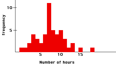
Part I: give some datasets and have them make frequency distribution table and some graphs a) Below are the data from students asked how many hours they had studied the previous weekend:
24,84,36,22,81,39,60,62,38,36,66,38,45,20,20,67,41,87,41,82,35,82,28,80,80,68,40,27,43,80,31,89,83,24 Make a grouped frequency distribution table and a histogram for these data. Describe the shape of the distribution.
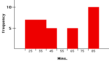
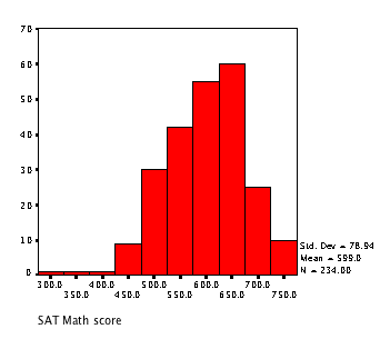
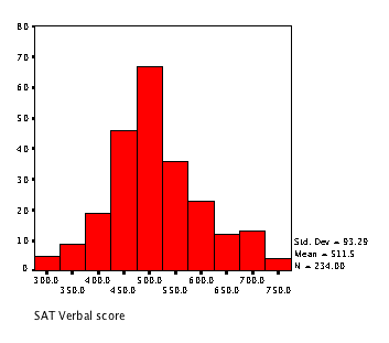
2) approximately rectangular (number of students in each grade of an elementary school) 3) positively skewed (people's networth in the U.S.) Part II: using the majors.sav datafile have them make several graphs in SPSS a) Make histograms (under the GRAPHS menu) of math and verbal sat scores. Describe the shape of the distributions
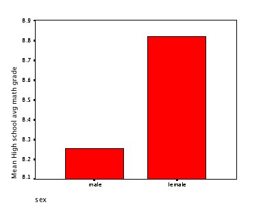
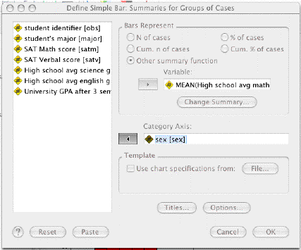
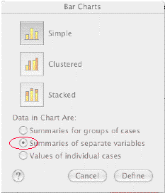
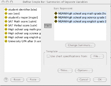
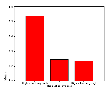
c) Make a simple bar graph using different columns as data (use summaries of separate variables), with average high school math, science, and english grades
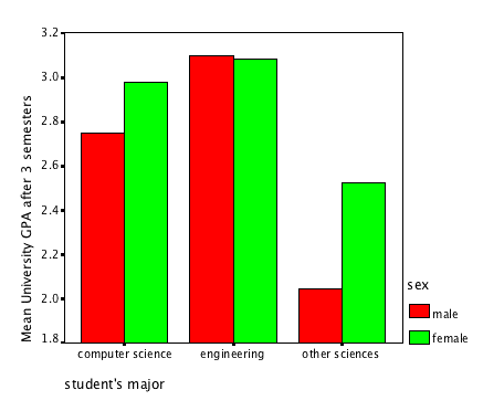
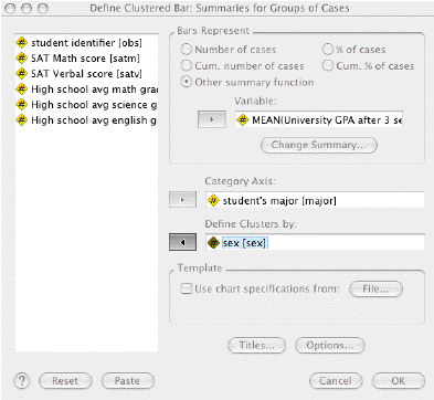
d) Make a clustered bar graph of college gpa (other summary function), with sex (clusters) and major (category)
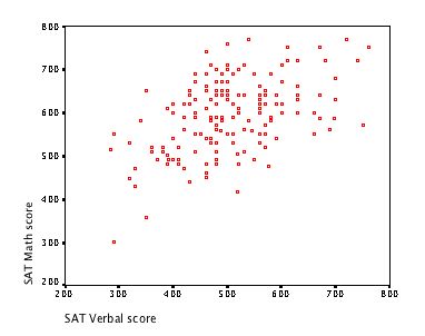
e) Make a scatterplot of math and verbal sat scores
|
||||||||||||||||||||||||||||||||||||||||||||||||||||||||||||||||||||||||||||||||||||||||||||||||||||||||||||||||||||||||||||||||||||||||||||||||||||
| | |||||||||||||||||||||||||||||||||||||||||||||||||||||||||||||||||||||||||||||||||||||||||||||||||||||||||||||||||||||||||||||||||||||||||||||||||||||
Questions regarding content of this site should be addressed to
Dr. J. Cooper Cutting, jccutti@ilstu.edu.